Intro
This article will teach you how to create a simple tabs feature in minutes. Tabs are important in the development of user interfaces. They are navigation elements used to allow users easily access different areas of a site or different parts of an individual page.
We will be building this Mini project with the following technologies
- NextJS
- TailwindCSS
Prerequisites
- An understanding of of HTML, CSS and JavaScript
- Basic Knowledge of React and the useState hook
- Familiarity with tailwind (Not so important tho 🌚😎)
Set up
Feel free to skip this part
To begin, make sure you have NodeJS installed on your machine and that you have a good text editor. I recommend VSCode.
The set up will be be done in 3 simple steps
- Install NextJS and Tailwind CSS
- Clean up the project
- Paste in necessary snippets
Step 1 - Install NextJS and Tailwind CSS
On your command line, navigate to your preferred directory and enter the following command.
npx create next-app react-tabs
or
yarn create next-app react-tabs
When its done installing, navigate to your newly created project
cd react-tabs
Run these commands to install tailwindCSS.
npm install -D tailwindcss postcss autoprefixer
or
yarn add tailwindcss postcss autoprefixer
And then npx tailwindcss init -p
Clean up the project
Open the project in your code editor. If you use VSCode simply enter code . on your CLI.
Delete the Home.module.css
Open the index.js file and delete everything leaving just the following.
import React from "react";

export default function Home() {
  return (
    <div>
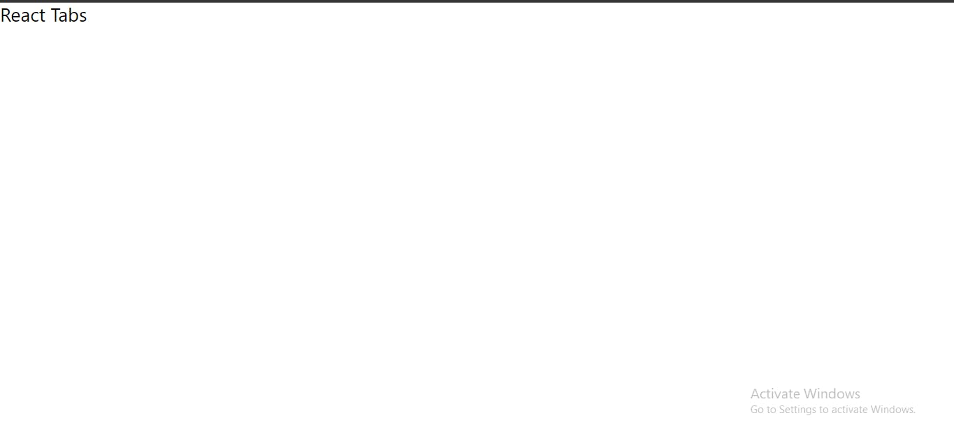
      <h1 className="text-3xl">React Tabs</h1>
    </div>
  );
}
Paste in necessary snippets
Open the tailwind.config.js file and paste the following block of code
module.exports = {
  content: [
    "./pages/**/*.{js,ts,jsx,tsx}",
    "./components/**/*.{js,ts,jsx,tsx}",
  ],
  theme: {
    extend: {},
  },
  plugins: [],
}
Don't worry, you'll be done setting up in a moment so you can jump right into the code.
Open globals.css and paste the following
@tailwind base;
@tailwind components;
@tailwind utilities;
The Code
🎉 You have successfully set up your tailwind project
I will abstract the set up part into a different article to save time on subsequent posts like this.
Now on your terminal, run yarn dev or npm run dev.
Go to your browser and enter localhost:3000
This is what your should get below:
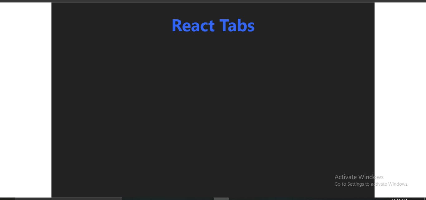
To make the project a little more pretty on the eyes, we'll be pasting in the following.
import React from "react";

export default function Home() {
  return (
    <div className="flex justify-center text-white">
      <div className="max-w-6xl bg-[#222] w-full min-h-screen p-12">
        <h1 className="text-6xl text-center text-[#3466F6] font-bold">
          React Tabs
        </h1>
      </div>
    </div>
  );
}
This is what you should have in your browser:
The Concept
Before going on with the code, lets get to understand the concept the tabs feature is based on. Tabs feature will consist of a tabs header and a tabs body. In the tabs header, we'll have tab options. The tab options will be an array of options that will be mapped and rendered on the page.
Just below our component, we will define the following array.
const tabOptions = [
  "Public Relations",
  "Marketing",
  "IT Department",
  "Security",
];
We will map the array in a div with a display of flex and justify-content of center so they are arranged next to one another .
So just below the h1 tag, we type / or paste the following code snippet.
(
<div className="flex justify-around mt-8 bg-[#333] rounded-full gap-5 p-2">
     {tabOptions?.length > 0 &&
        tabOptions.map((tab) => (
          <div
            className={
              "py-5 w-full rounded-full text-center cursor-pointer hover:bg-[#3466F699] transition-all duration-300 "
            }
          >
            <p className="font-bold text-lg">{tab}</p>
          </div>
     ))}
</div>
)
Make sure you rap your classNames in curly braces. We will be dynamically applying styles to our tab options.
Next we will have 4 other arrays for the for departments. Each array will be mapped and rendered under its corresponding tab.
const pulicRelations = ["Joseph", "Stacy", "Emily", "Brian"];
const marketing = ["Joseph", "Stacy", "Emily", "Brian"];
const ITDept = ["Joseph", "Stacy", "Emily", "Brian"];
const security = ["Joseph", "Stacy", "Emily", "Brian"];
The Magic ✨🔮
To keep track of a selected tab, we have to store that tab in state. We'll call that state "activeTab".
When a tab option is clicked, we will store the option in the activeTab state and conditionally render items based on the value of that state. We will also conditionally apply some styling to the selected tab option. That's why we had to wrap our className in curly braces 😎.
Inside of your Home component, before the return keyword, create the activeTab state using the useState hook. Make sure to import useState.
const [activeTab, setActiveTab] = useState();
We also want a default active tab once a user lands on the page. To do this, we set the initial value of activeTab to the first option.
const [activeTab, setActiveTab] = useState(tabOptions[0]);
To allow us switch between tabs, we will add an onClick event on our tab option. Therefore, on click of that option, the value of activeTab state will be set to the option that was clicked.
For the changes to noticed on the tab option, we will add a logic to dynamically add a background color to that tab option if it is active.
our tab option element will look like this now:
(
   <div
    className={
      "py-5 w-full rounded-full text-center cursor-pointer hover:bg-[#3466F699] transition-all duration-300 " +
      (activeTab === tab && " bg-[#3466F6]")
    }
    onClick={() => setActiveTab(tab)}
  >
    <p className="font-bold text-lg">{tab}</p>
  </div>
)
Notice the conditional statement and the onClick that has been added?
One more step to go 🚀
For the last part, we will render items on the page corresponding to the selected tab. This will be done using a a concept called Conditional Rendering
So, just below the Tabs header paste the following code
  {/* ====== Tab Body ====== */}
        <div className="my-4 p-6">
          {/* ======== PUBLIC RELATIONS TAB ======== */}
          {activeTab === "Public Relations" && (
            <div>
              {publicRelations?.length > 0 &&
                publicRelations.map((member) => (
                  <p className="text-2xl text-gray-200 font-semibold py-2">
                    - {member}
                  </p>
                ))}
            </div>
          )}

          {/* ======== MARKETING TAB ======== */}
          {activeTab === "Marketing" && (
            <div>
              {marketing?.length > 0 &&
                marketing.map((member) => (
                  <p className="text-2xl text-gray-200 font-semibold py-2">
                    - {member}
                  </p>
                ))}
            </div>
          )}

          {/* ======== IT DEPARTMENT TAB ======== */}
          {activeTab === "IT Department" && (
            <div>
              {ITDept?.length > 0 &&
                ITDept.map((member) => (
                  <p className="text-2xl text-gray-200 font-semibold py-2">
                    - {member}
                  </p>
                ))}
            </div>
          )}

          {/* ======== SECURITY TAB ======== */}
          {activeTab === "Security" && (
            <div>
              {security?.length > 0 &&
                security.map((member) => (
                  <p className="text-2xl text-gray-200 font-semibold py-2">
                    - {member}
                  </p>
                ))}
            </div>
          )}
        </div>
Before you feel overwhelmed
This is the basic logic behind the above snippet.
- For each array, we check if that tab is equal to the value of the activeTab state (If this tab is the active tab).
- If it is, we present it to the user, else, we dont.
- Under each tab, we make sure that the array of members being mapped has its length greater than 0, and if so, we map its elements and render them to the page..
Your final Code will look like this
import React, { useState } from "react";

export default function Home() {
  const [activeTab, setActiveTab] = useState(tabOptions[0]);

  return (
    <div className="flex justify-center text-white">
      <div className="max-w-6xl bg-[#222] w-full min-h-screen p-12">
        {/* PAGE TITLE */}
        <h1 className="text-6xl text-center text-[#3466F6] font-bold">
          Company Departments
        </h1>

        {/* ===== Tabs Header ======  */}
        <div className="flex justify-around mt-8 bg-[#333] rounded-full gap-5 p-2">
          {tabOptions?.length > 0 &&
            tabOptions.map((tab) => (
              // ===== Tabs Option ======
              <div
                className={
                  "py-5 w-full rounded-full text-center cursor-pointer hover:bg-[#3466F699] transition-all duration-300 " +
                  (activeTab === tab && " bg-[#3466F6]")
                }
                onClick={() => setActiveTab(tab)}
              >
                <p className="font-bold text-lg">{tab}</p>
              </div>
            ))}
        </div>

        {/* ====== Tab Body ====== */}
        <div className="my-4 p-6">
          {/* ======== PUBLIC RELATIONS TAB ======== */}
          {activeTab === "Public Relations" && (
            <div>
              {publicRelations?.length > 0 &&
                publicRelations.map((member) => (
                  <p className="text-2xl text-gray-200 font-semibold py-2">
                    - {member}
                  </p>
                ))}
            </div>
          )}

          {/* ======== MARKETING TAB ======== */}
          {activeTab === "Marketing" && (
            <div>
              {marketing?.length > 0 &&
                marketing.map((member) => (
                  <p className="text-2xl text-gray-200 font-semibold py-2">
                    - {member}
                  </p>
                ))}
            </div>
          )}

          {/* ======== IT DEPARTMENT TAB ======== */}
          {activeTab === "IT Department" && (
            <div>
              {ITDept?.length > 0 &&
                ITDept.map((member) => (
                  <p className="text-2xl text-gray-200 font-semibold py-2">
                    - {member}
                  </p>
                ))}
            </div>
          )}

          {/* ======== SECURITY TAB ======== */}
          {activeTab === "Security" && (
            <div>
              {security?.length > 0 &&
                security.map((member) => (
                  <p className="text-2xl text-gray-200 font-semibold py-2">
                    - {member}
                  </p>
                ))}
            </div>
          )}
        </div>
      </div>
    </div>
  );
}

const tabOptions = [
  "Public Relations",
  "Marketing",
  "IT Department",
  "Security",
];

const publicRelations = ["Joseph", "Stacy", "Emily", "Brian"];
const marketing = ["Yoshi", "Jefferson", "George", "Owen"];
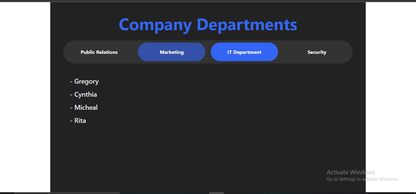
const ITDept = ["Gregory", "Cynthia", "Micheal", "Rita"];
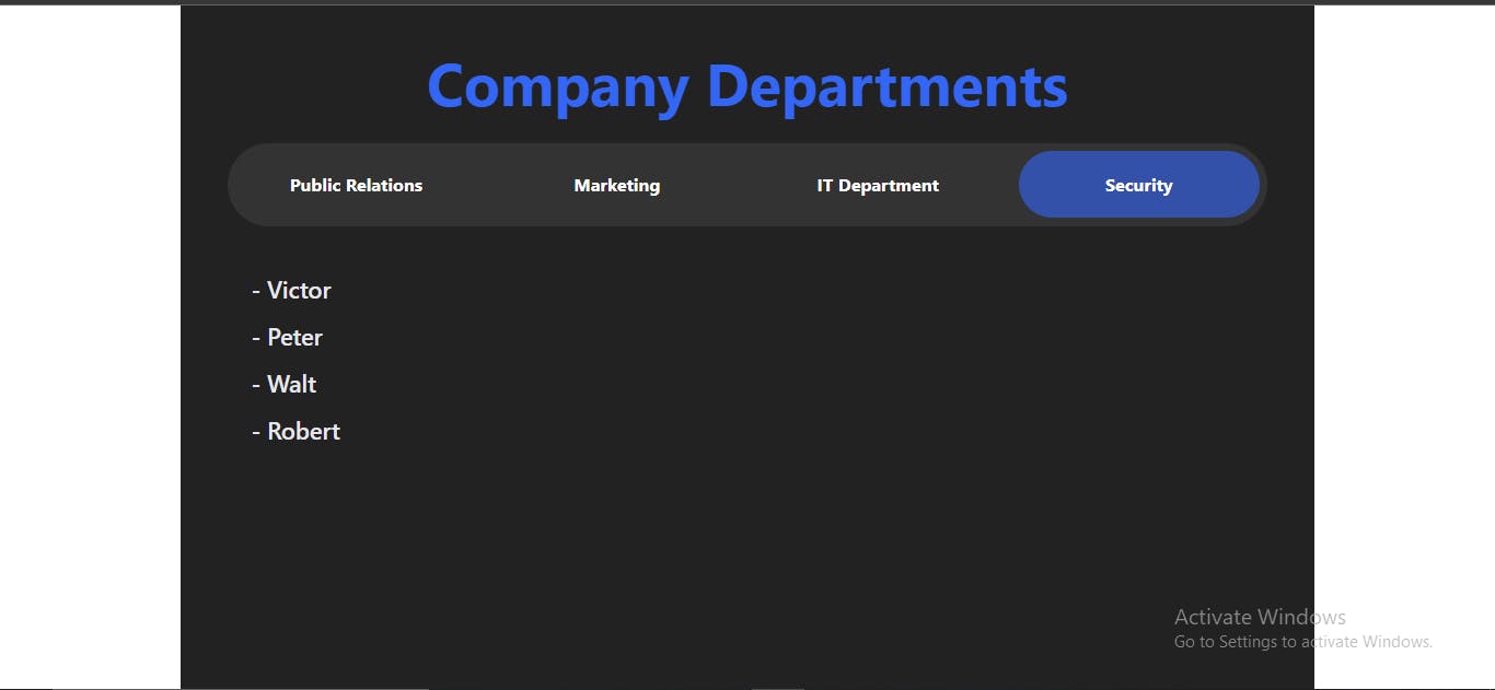
const security = ["Victor", "Peter", "Walt", "Robert"];
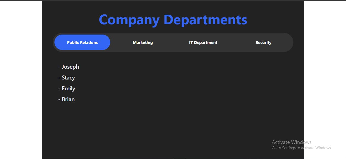
This should be your output on the browser
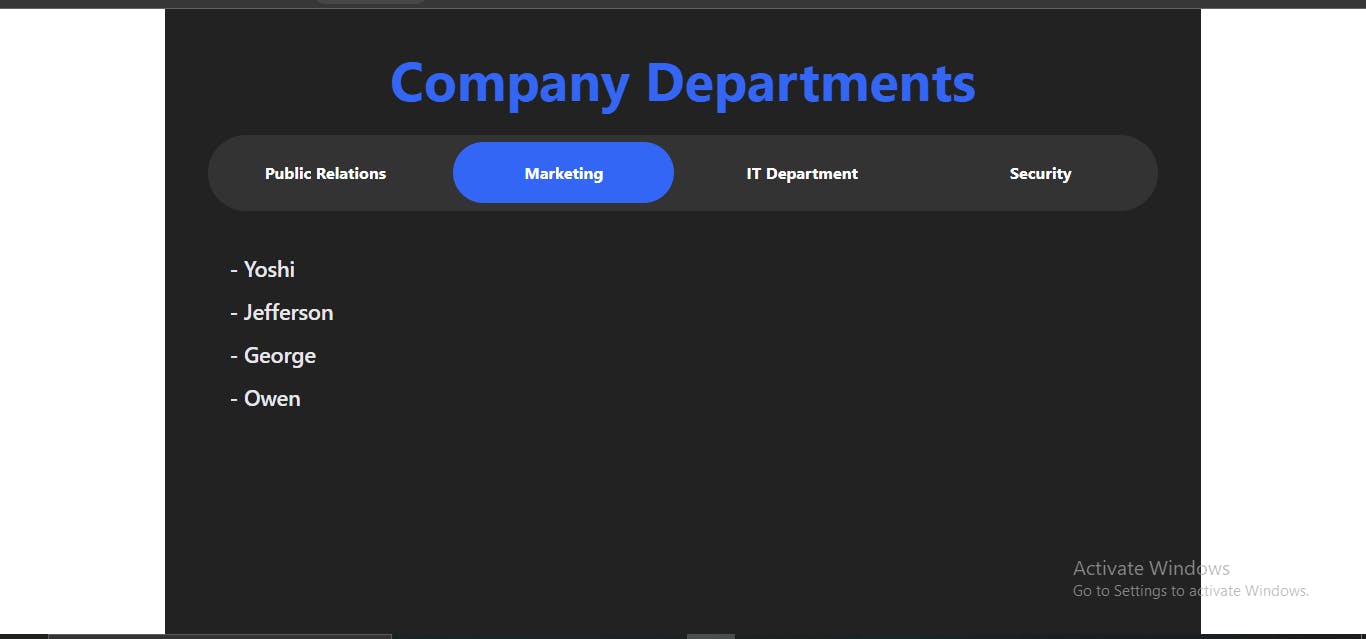
You can render whatever element or component you wish under each tab. Play around with the code and try out new stuff.
Conclusion 🏁
And that's it my friends, you have made to the end of this tutorial.
- Drop a like and ask questions in the comments section.
- I'd like to know how to better optimize this so your ideas and contributions are welcome.
- Later, I will publish another article on how to make this a reusable component, so make sure to follow me to get more content like this one

